Word Theme
First List of Words
The following list of words was produced from my previous topics of abstraction and structure, using words that apply to my responses in those subjects.
Abandonment
Community
Colour
Bleakness
Past
Dormant
Contrast
Displacement
Misplaced
Texture
Discolouration
Urbanisation
Street
Reconstruction
Distortion
Olds vs new
Comparison
Film
Negative
Nature
Warm
tones
Community
Colour
Bleakness
Past
Dormant
Contrast
Displacement
Misplaced
Texture
Discolouration
Urbanisation
Street
Reconstruction
Distortion
Olds vs new
Comparison
Film
Negative
Nature
Warm
tones
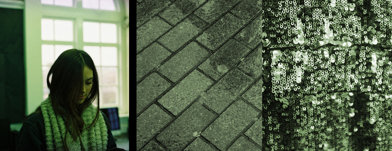
The three words I have chosen are contrast, texture and street.
I am going to shoot Texture on film.
There will be a focus on framing and buildings and people for street.
Wider range of subjects for contrast.
I am going to shoot Texture on film.
There will be a focus on framing and buildings and people for street.
Wider range of subjects for contrast.
Texture
Artist Reference
Tom Evans
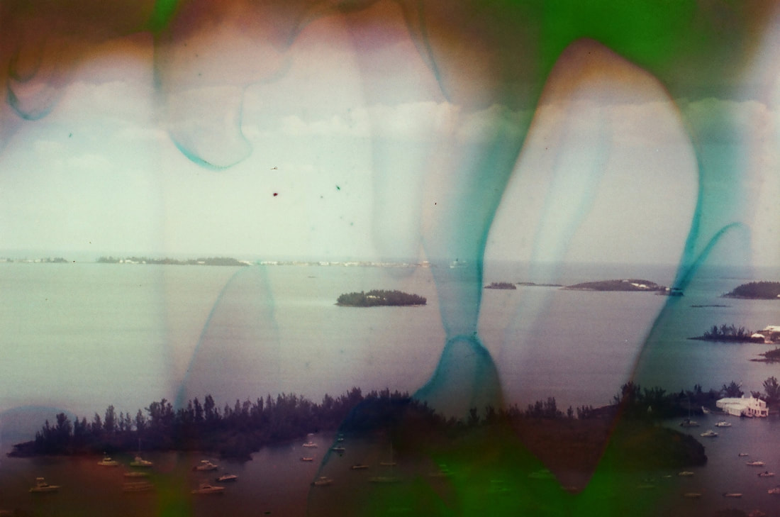
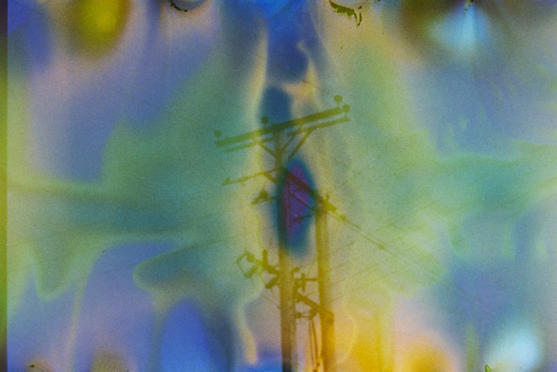
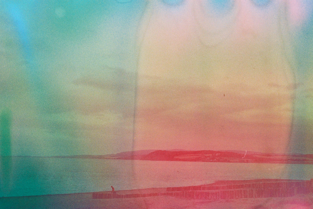
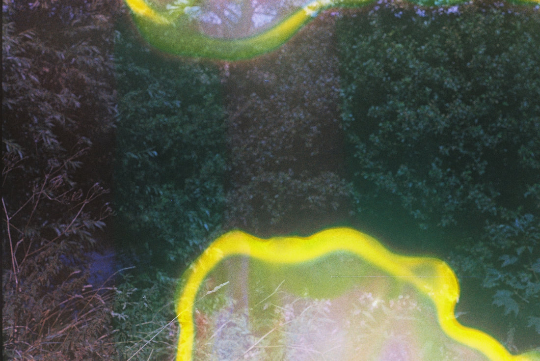
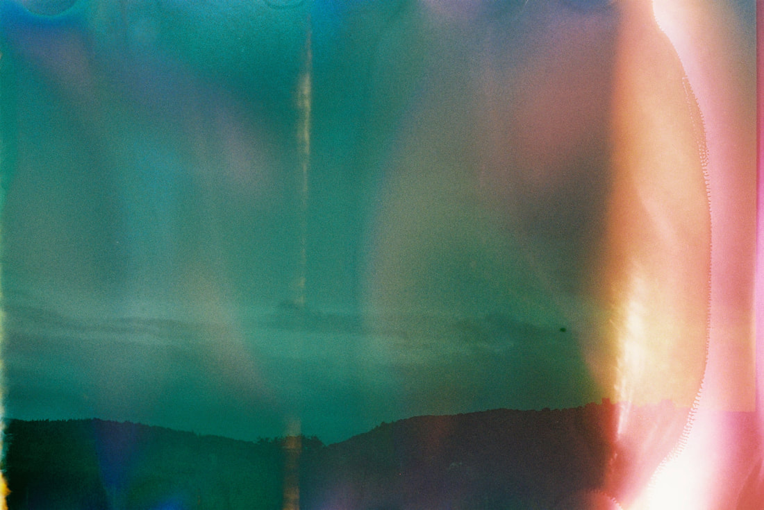
For this part of the project, the word I explored is texture. To do this I used film and used different 'film soups' to create a texture on top of pictures I took whilst in the countryside of England.
I used two different batches of soup for two different rolls of film, the first being lemon juice and blueberries and the second being hand soap and sea salt. The film is altered by the different acid levels from the objects used in the soup, which warps it in different colours and textures like bubbling or wave-like patterns.
I took pictures on the film and then to get the soup into the film I soaked the film in a mixture of these ingredients for 48 hours, then let them dry for a couple of days in the sun, and luckily I knew somebody who would develop the film at their shop even if it was souped, but before asking him I was denied by a shop as it would damage others film.
This part of the word project also took inspiration from artists Tom Evans and Barbara Murray who use film souping as a technique to create these surreal images with unusual colours and formations layered on top of the images.

|
|
The picture above on the left is from Barbara Murray and the right is is from photographer Tom Evans, who are both fans of this technique because of the process of souping the film making each picture different. They find beauty in how you can re-use the same recipe multiple times and get a unique result every time, and they use items like alcohol, hot sauce and lemon juice. They think about the pH balance in their pictures, the more acidic the soup is, the more damaged the film will be, and the more normal ingredients, the more colourful your pictures will be.
Below are all the images I took after souping and developing them.
Below are all the images I took after souping and developing them.
Final Edits
|

|
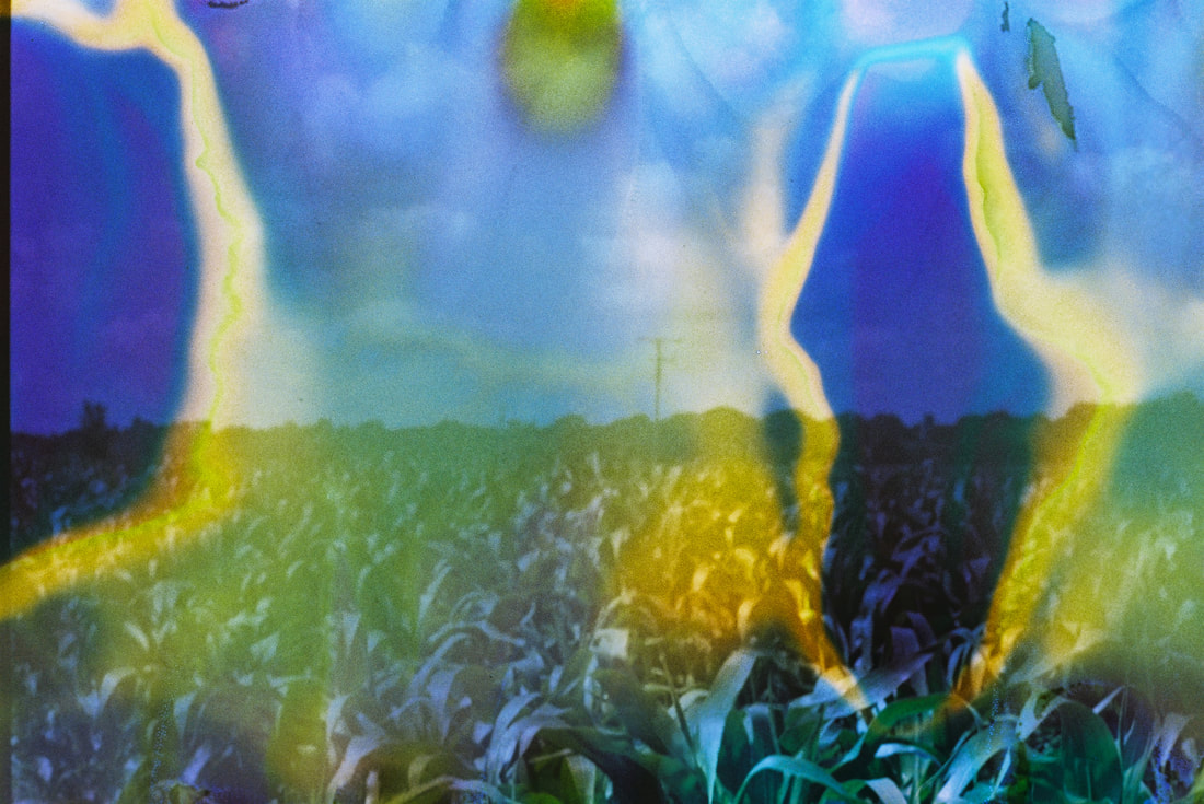
The yellow and blue images are souped with blueberries and lemon juice over pictures of the countryside in Taunton, in the fields.
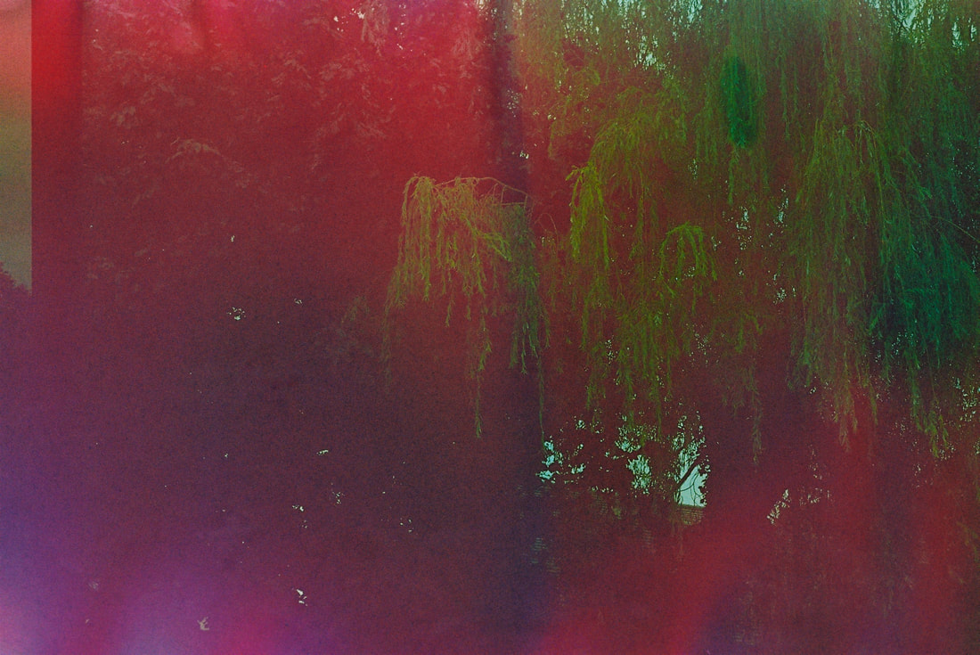
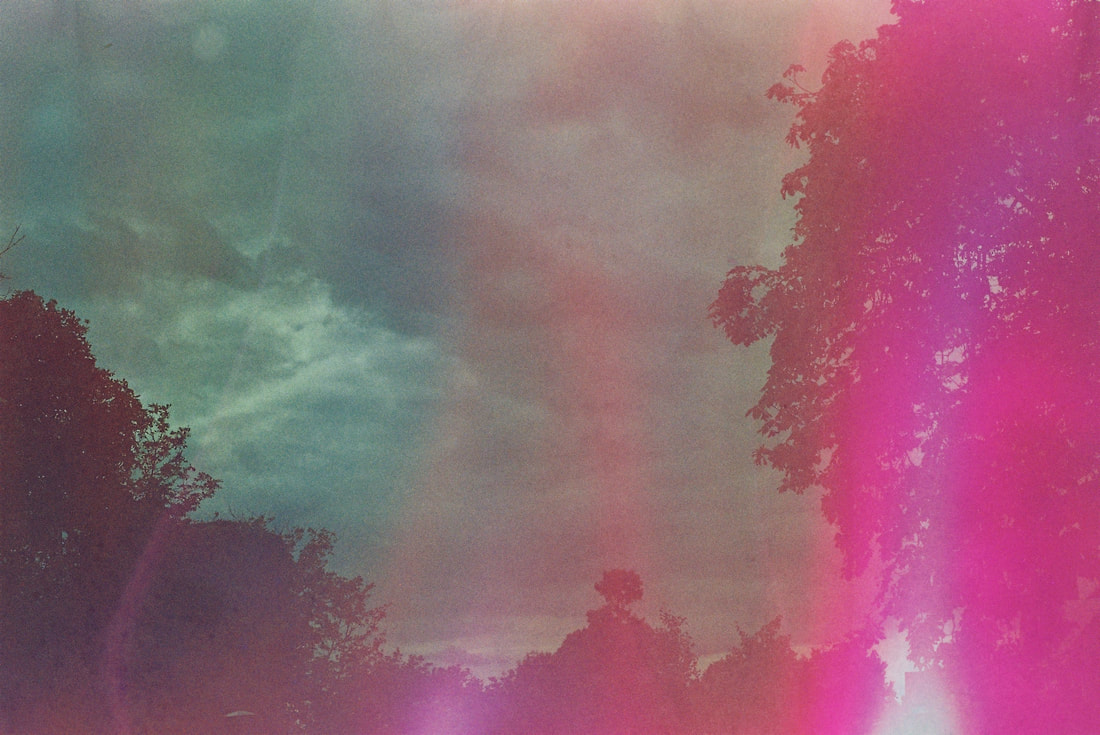
The red and pink are in a similar area by the seaside souped using hand soap and sea salt.
The red and pink are in a similar area by the seaside souped using hand soap and sea salt.
Evaluation
Overall I think this is my best response to the word task, I think my choice to soup pictures of rural areas with bright colours turned out well, and the texture of the soup over the texture of the nature and natural patterns in the countryside work well together to create an almost other-worldly set of images that feel surreal.
The work I produced features more pattern-like layering of soup over the images compared to my featured artists Tom Evans and Barbara Murray, who's pictures are more altered with the colour.
I also think my framing of the pictures allowed the two textures to blend together in an interesting way, exceeding my expectations and intentions.
I am going to use the word "texture" to continue this project, finding 2 new ways to shoot the theme, whilst doing a continuation of souping film.
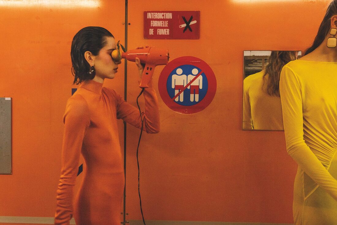
Contrast
Harry Gruyaert
|
Here I explored the word "contrast" through photographing opposing colours so they stand out amongst the city. I looked for these around central London to achieve this and have these colours against the darker colours of the city.
I went to Soho for the bright colours and looked around for striking colours that contrast each other. The work reminds me of the artist Harry Gruyaert, who's work features colour as the main feature, his work is shown to the right. Below are the pictures I took. |
|
I then increased the contrast and saturation to make the colours brighter and more obviously the focus of the images.
Final Edits
|
|

Evaluation
Overall I think I completed this task well.
I got pictures of contrasting colours in the natural environment of the city, but not in the extremity that Harry Gruyaert does, with more grey areas around the focus of the photography.
My task was hardened by having to find contrasting colours in the first place, as it is not common to find in the city because it can look less professional on store fronts, which is what I was looking for.
I believe my framing could have been better too, but it works well with the natural feeling of the photos.
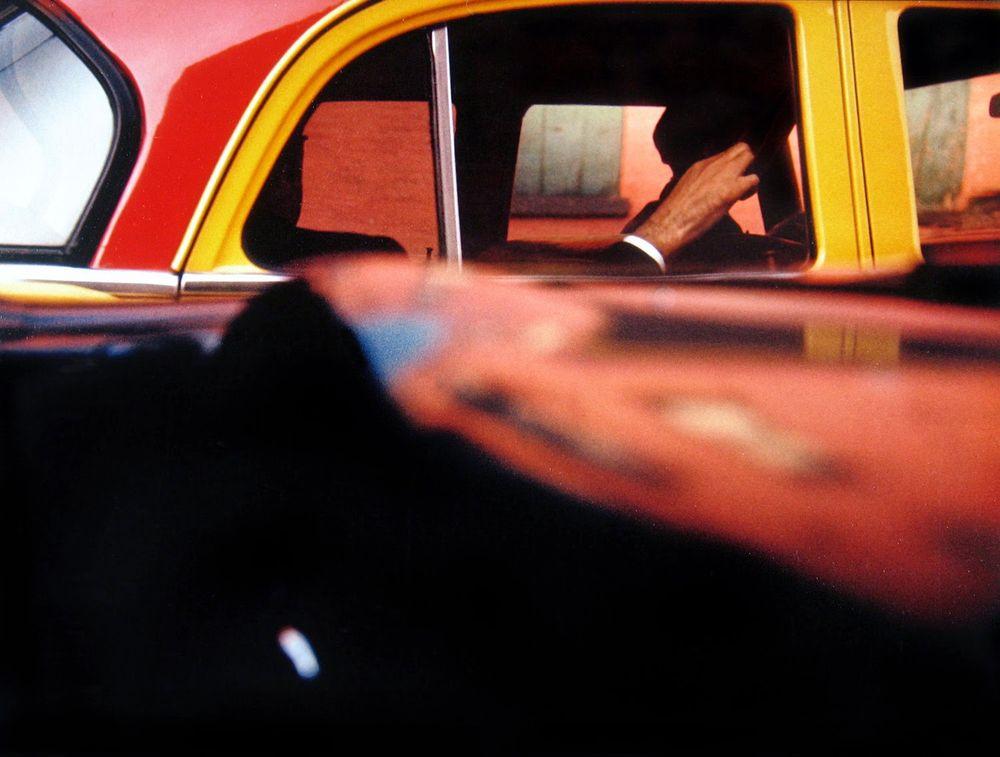
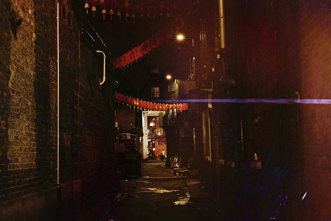
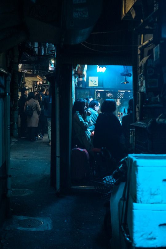
Street
|
For this area of the project, I will be putting a focus on people in their natural environment next to buildings.
My aim was to put focus on the people in the streets, using the city's buildings to frame them. My inspiration for this part of the project was Saul Leiter, a famous 1950's to 60's photographer who's work also features interesting framing of the environment to capture people in the city, to the right is his work. |
|
Final Edits
|
|

Re-edited Final Pictures
|
|

Evaluation
Initially I was happy with the work I had produced, and thought that it was reminiscent of the work of Saul Leiter, however after further re-evaluation I decided I was happy with the framing of the images, but wanted the warmer lighting that Leiter uses.
I took the photos I edited before which had been cropped and had saturation and lighting adjusted, but this time I used colour correction to make the hard lights softer.
Overall, now I am much more pleased with my photography in this project, because I think the blend of lighting, composition and framing has come together to make images that pinpoint the subject - the person - whilst creating a frame around them with the natural environment of the city. I would have liked to include more motion blur in the people in the photos to show how busy central London is, but I think that could contrast the softer, calm lighting in the images.
Ideas For Second Part
3 strands for texture
warped
translucent
weathered
different ways to shoot the word texture
Word Theme 2
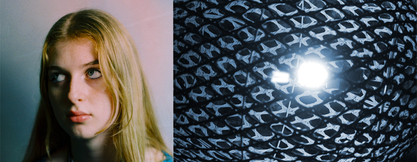
Translucent In Texture
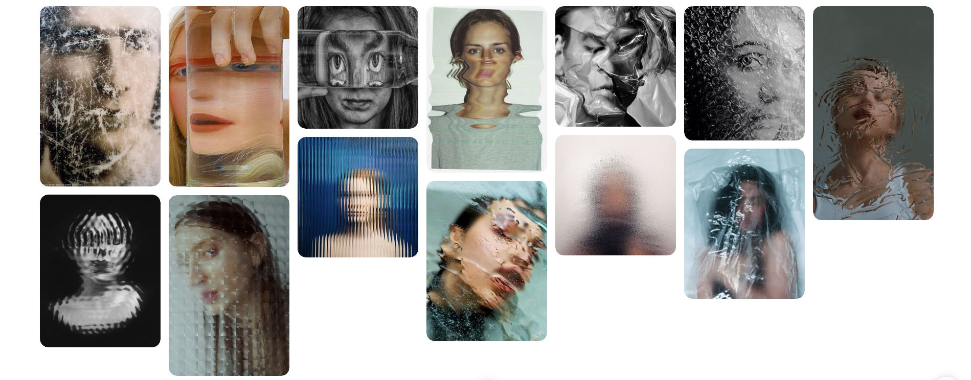
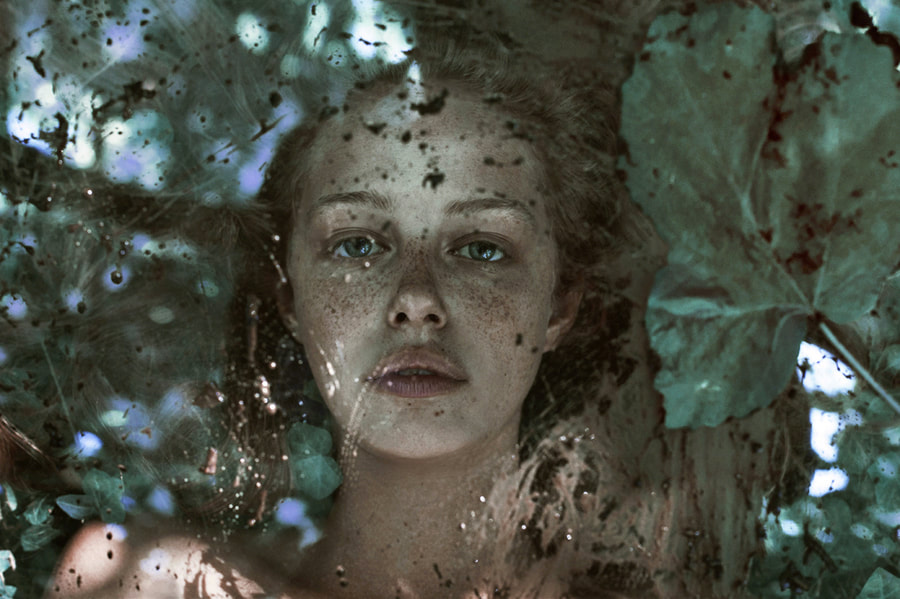
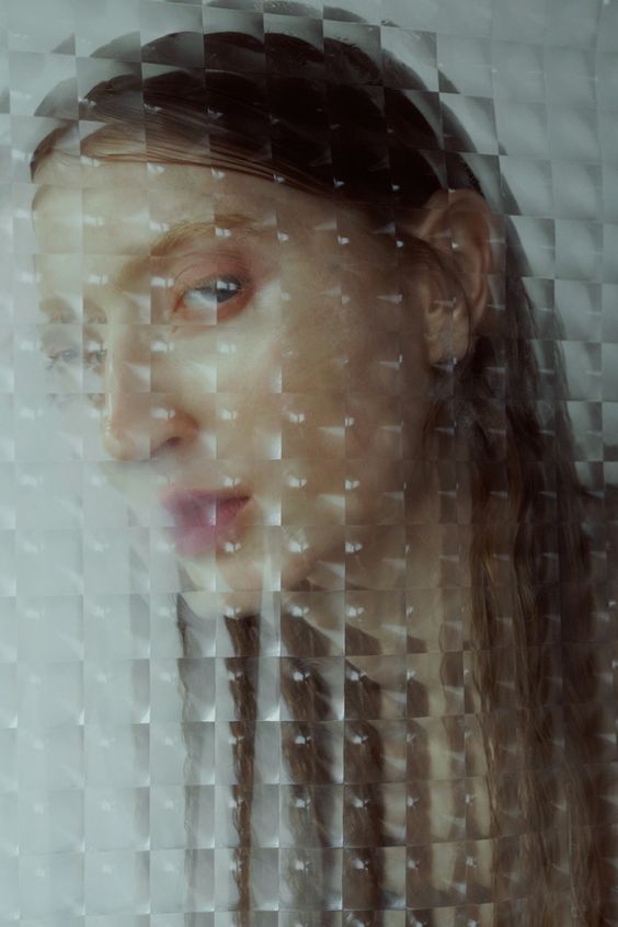
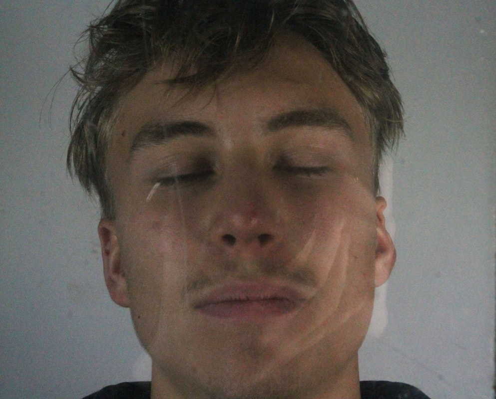
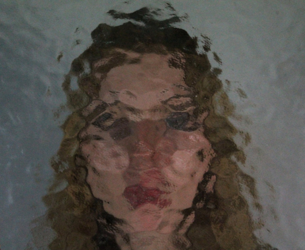
Here I want to explore the patterns and distortion of texture when a model is behind glass, whilst also exploring the texture of the glass itself. These will be portraits as if they are through a filter. An artist I am taking artistry from Marta Bevacqua.
The portaits will be of classmates against a white background.
The portaits will be of classmates against a white background.
Marta Bevacqua
|
Bevacqua is an Italian artist based in Paris, who works in film and photography in her work. In this specific project called "Through the Glass", she created portraits of girls "you aren't likely to notice on the streets" behind glass that is either patterned, dirty, wet or broken. I want to also use this idea of portraiture with the model behind glass to emphasise the alteration of texture in the face the glass creates.
|
|
I used pieces of glass that were cracked, scratched, textured or dirty as a filter in between the camera lens and models' faces. The result shows the effect of the texture of the glass against the people's faces, altering them and almost adding what looks like scars in some areas.
My final three edits will have the brightness, contrast and crop adjusted to only be a portrait.
My final three edits will have the brightness, contrast and crop adjusted to only be a portrait.
Final Edits
|
|

|
Evaluation
This project was successful as I created work that achieved what I desired in terms of portraiture and texture, using glass to create new looks for people and the texture of their faces.
I like my framing by just showing close head shots of the models. I am happy with my relation to the artist Marta Bevacqua, but ideally I could have a different model for another final edit.
All the images were taken against a white backdrop in school, and afterwards I increased the lighting and cropped the images.
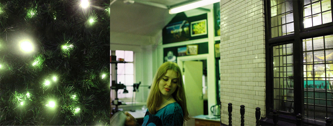
Warped Texture 2: Soho
Here I am going to make my work a continuation of my work in "Texture", by souping film photography of the city, moving on from the rural areas, I will try a new recipe to match grey days in the city with possible cityscapes.
I am inspired by the work I have seen of Elsa Bleda.
I am inspired by the work I have seen of Elsa Bleda.
Artist Reference
Elsa Bleda
|
Elsa Bleda is a photographer who was born in and continues her work in South Africa, her project "Nightscapes" is a series of photographs over 10 years of the South African cityscapes at night.
Although her work isn't souped, I want to achieve a similar colour and hue in the images combined with getting an over-layed texture on top of the image by souping it. Another artist who's work I am intrigued by is Elzi Boba and her film soup work with the city such as this picture to the right.
|
|
Process
Some recipes I am thinking of using to get a blue and green pattern over my images is sea salt, dish soap and boiling water or Californian lemonade, which is soda, whiskey and lemons with sugar.
For the first set of pictures, I am going to soak the film after I have taken the pictures then get them developed and upload the digitals, after cropping them if need be, to leave the random natural texture the recipe creates.
For the next set of pictures I will take at the same time, I will use Revolog film which is a film designed to change the colour of the images when developed, so I will see the difference between the two sets of images.
After taking my images of China Town in Central London, my film ripped off the cartridge and got exposed to the light, so I will soup it and see what I can salvage. If too much damage is done, I will have to re-take the images and also continue with the Revolog film earlier than expected.
My Response
Edits


Evaluation
Whilst trying to achieve a darker type of photography with the use of film soup, I created something that differs from my goals but still emphasises the lights in the night of central London like I wanted them to.
I intended to have more green and blue in the images, but I still think the pink crossed with the blue gives the same feeling, which was brought out when I souped the pictures in whiskey and lemonade. I think a strong point of the pictures is the blue dots and streaks created crossed with the texture of the light, almost using the actual focus of the image as a background in the end result.
I intended to have more green and blue in the images, but I still think the pink crossed with the blue gives the same feeling, which was brought out when I souped the pictures in whiskey and lemonade. I think a strong point of the pictures is the blue dots and streaks created crossed with the texture of the light, almost using the actual focus of the image as a background in the end result.
Second Edits
As I thought the images lacked the pattern and texture of the chemicals they were souped in, I re-edited the images to bring out more colour, especially from the souping process. In the next set of images below, the blue comes out much more vibrantly and visibly.
This is closer to the product that I wanted to end up with naturally, like I did in the first part of the strand, where the images are almost unrecognizable apart from small features that the soup doesn't effect.
However I like the minimalism of the soup's effect in these pictures, as it feels like it coincides with the nightlife more.


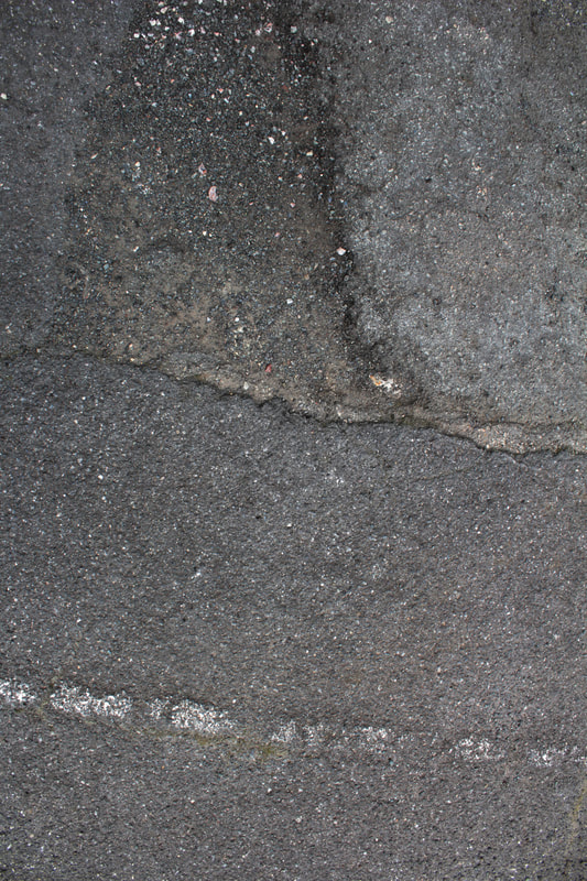
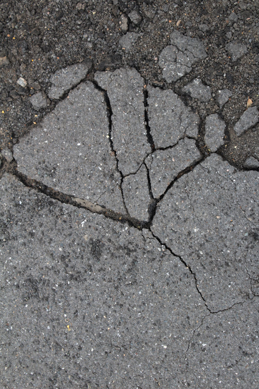
Weathered Texture

For this strand of texture, I am going to photograph cracks and breaks in walls, pavements and buildings.
The smashed material's texture will be the focus of the photography.
The smashed material's texture will be the focus of the photography.
My Response
|
After taking my pictures I think they resemble work from the Boyle Family, who take pictures of the floor outside in streets as a collective group of artists based in London. Their work does not exclude anything as a subject, and are most well known for their earth studies. I feel my work was similar to theirs as most of the cracks and weathered material I found was on the pavement and floors.
|
|
Final Edits
|
|

|
Evaluation
Overall, within this part of the project I believe my work is strong in showing the texture of weathered buildings and man-made creations, which is what I aimed to do, and found many artists that I think my work relates to.
My photographs were taken outside the school of parking lots and roads.
The wear of the roads also gives it some character, as many people going to work and travelling everyday have contributed to what the texture of it is now.
After I took the pictures I cropped them and increased the contrast and lowered the brightness in photoshop, to emphasise the cracks and fractures in the earth.
I took multiple pictures vertically so I could present them next to each other, almost looking linked, then others were shot landscape to show the intricate details of them like the one above with colour. I enjoy my framing in these pictures as I feel they aren't too far from the subject nor too close, but close enough to show the texture I aim to photograph.
Favourite Strand
My favourite strand is the strand that involves film soup, and I am going to initially develop it through physically altering the film in hand again but with printed out digitals on things like tracing paper that I will burn and stain and cut.
I will get pictures of Alexandra Palace in the evening for this.
I will get pictures of Alexandra Palace in the evening for this.
Warped Texture 3: West Bank
Process
For this development I am going to continue my film soup work and take pictures of Muswell Hill souped in a mixture of lime and dish detergent, although I don't know what these will look like together, I know that bleach alone sort of makes the image glow and brightens it, and citrus warps the colour of the subject you photograph. I want the images to relate to the idea of how they are being cleaned out, with two chemicals that are used everyday for cleaning in life.
I will also shoot on digital to show the difference of what I am photographing.
I will also shoot on digital to show the difference of what I am photographing.
Artist Reference: Katie Small
|
|
Above are images from Katie Small, which shows results after using Californian lemonade, using lemons sugar and whiskey. I have chosen to respond to her work because I have taken an interest in the wide landscape shots she uses and how the film soup distortion works with the subjects in the photograph, such as the trees and leak of chemicals that look like more trees.
I want to respond to her work similarly
I want to respond to her work similarly
My Response
Film
I went to the South Bank and took pictures whilst I was there, I focused on the Thames for the ripples in the water, and any other parts of the area that had a lot of texture, such as the wet concrete steps and the trees that lack leaves.
I souped them in the dish detergent and lime, because I think the detergent will create blotches in the colour and the lime will add the acidity, putting colours into the image and create patterns.
I souped them in the dish detergent and lime, because I think the detergent will create blotches in the colour and the lime will add the acidity, putting colours into the image and create patterns.
Final Edits


When taking these pictures, I had predicted the washing powder and lime would create blue and green patterns and would swirl and morph the colours, so I focused on the water in the Thames and the sky, so similar colours would all mix together.
Above are my best edits from my favourite pictures that I shot, edited in Photoshop by increasing their contrast, saturation and lowering the brightness in some cases.
Above are my best edits from my favourite pictures that I shot, edited in Photoshop by increasing their contrast, saturation and lowering the brightness in some cases.
Digital
As film takes a while to shoot, soup and develop, I decided to shoot digitally alongside shooting on film to complete weekly developments, and for this development I shot the same pictures on film and digital so I can edit both and see the difference between using actual chemicals and recreating the effect of chemicals on photoshop.
I will be editing the digitals first so I will have to edit them in the way I imagine the chemicals will affect the film.
I will be editing the digitals first so I will have to edit them in the way I imagine the chemicals will affect the film.
Digital Edits
Whilst I was waiting for the film I shot to be developed, I wanted to try and emulate the look I was hoping for on the digital images, so I selected parts and layered and painted them on photoshop to make it look like the chemicals had affected the pictures.

Evaluation
Overall, within this development, I am pleased with my the pictures I took and how the process of souping them altered them. I think that the pictures taken on film relate to the artist I originally referenced in my 2nd development, Elzi Boba, but also have the brightness and softness of the artist reference from this development, I think my mixture of lime juice and washing up powder worked well together with colours and warping the images.
I prefer my film pictures to the digitals, as I feel the editing on the digital images looks too artificial, whilst the film looks natural and aged.
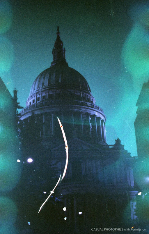
I think the cityscape pictures, especially the one including the St. Pauls Cathedral look almost ethereal with the patterns in the sky and Thames, with buildings being warped. I edited the pictures with photoshop for both times, and I believe that the increase in contrast and saturation brings out the colours and makes the film soup process look even more extraordinary.
For my next development I will be shooting on Fuji film and colour-changing film, only souping the Fuji as it uses different chemicals than Kodak, so it will have different effects, specifically more colour changing hopefully. I will be shooting Paris on film, as it differs from shoots of London and I should use the opportunity to do so whilst I am there for a school trip to see famous exhibitions and museums of photography.
I prefer my film pictures to the digitals, as I feel the editing on the digital images looks too artificial, whilst the film looks natural and aged.
I think the cityscape pictures, especially the one including the St. Pauls Cathedral look almost ethereal with the patterns in the sky and Thames, with buildings being warped. I edited the pictures with photoshop for both times, and I believe that the increase in contrast and saturation brings out the colours and makes the film soup process look even more extraordinary.
For my next development I will be shooting on Fuji film and colour-changing film, only souping the Fuji as it uses different chemicals than Kodak, so it will have different effects, specifically more colour changing hopefully. I will be shooting Paris on film, as it differs from shoots of London and I should use the opportunity to do so whilst I am there for a school trip to see famous exhibitions and museums of photography.
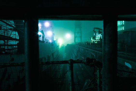
Warped Texture 4: Shoreditch
Process
For this development, I took pictures of the early evening in Old Street and Shoreditch on Saturday, capturing elements of the emptiness in areas and the nightlife in the main streets.
I souped the pictures in mushroom-soaked water and lemon with inspiration from my artist seen in the artist reference.
Although Seung-Hwan Oh uses his technique on portraits, I am going to use it on landscape images of the city.
I souped the pictures in mushroom-soaked water and lemon with inspiration from my artist seen in the artist reference.
Although Seung-Hwan Oh uses his technique on portraits, I am going to use it on landscape images of the city.
Artist Reference: Seung-Hwan Oh
Seung-Hwan Oh is an artist from Seoul, who studied film and photography, and says his work is inspired by the different feelings towards "different thoughts and ideas, from philosophies to science". The series he put together called "Impermanence" consists of portraits that he took and drenched in fungus mushrooms. The bacteria affects the film and warps the image.
|
|
My Response
Final Edits


Trip To Paris
Jeu de Paume
Warped Texture 5: Paris
Part A
Process
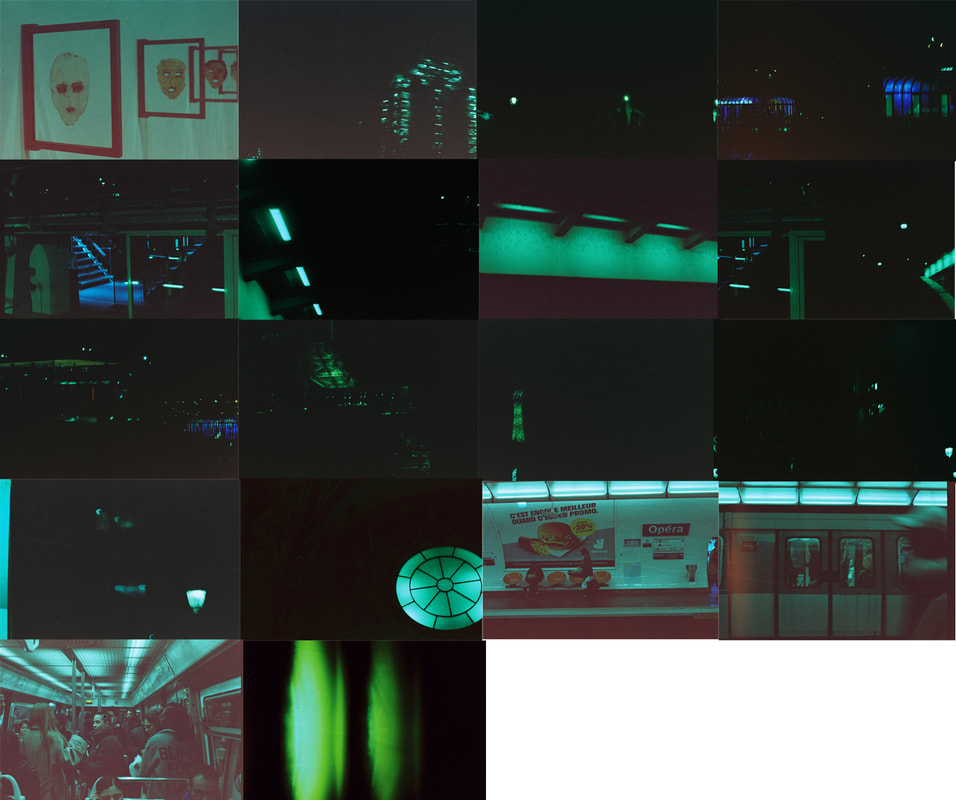
For this part of the development, I will shoot on colour changing film, which will tint everything I take blue. This is Revolog film so I do not need to soup it to achieve this. I will be taking pictures of Paris with this film, as I can use the opportunity to do so whilst I am there and it is more diverse than only shooting in the UK.
Artist Reference: Bitpunk
Bits of Bitpunk are two concept artists living in Osaka with a passion for design, art, games and Japan. Bitpunk is their name and a photo collection of the dark, neon side of Asia. The work they produce is mainly tinted with a blue colour that makes the images feel cold but inviting as they are brightly lit and so interesting.
|
|
My Response
Final Edits


Part B
In this next part of the same development, I will be shooting on film and souping it.
I will be using old Fuji film as Fuji use different chemicals in their film, so souping it will have a different effect and will instead bring out more colour than using Kodak does. So for this part I will be shooting Paris on film again but souping it with dish soap, salt and pink food dye, so it contrasts the blue-coloured photography I do with the Revolog film.
I will be using old Fuji film as Fuji use different chemicals in their film, so souping it will have a different effect and will instead bring out more colour than using Kodak does. So for this part I will be shooting Paris on film again but souping it with dish soap, salt and pink food dye, so it contrasts the blue-coloured photography I do with the Revolog film.
Artist Reference: Allison Charnin
|
Allison Charnin is a landscape photographer and in this series she went to Paris and captured her trip on 35mm film. As she says "These images seem to capture both the history of Paris and also the vibrancy and creativity it has brought out in artists through the ages."
|
|
My Response
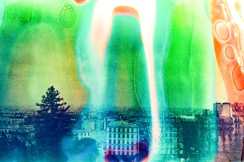
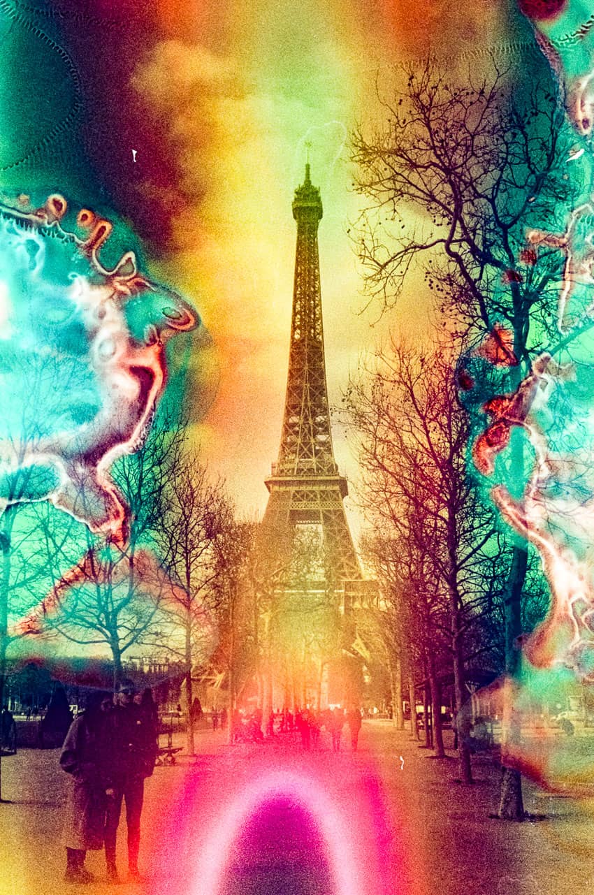
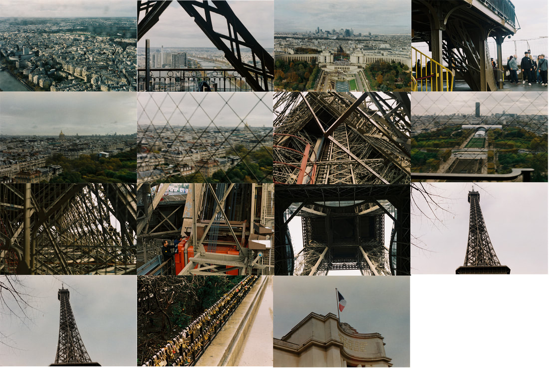
After taking my pictures in Paris, I decided that an interesting idea would be to see what kind of textures would be created through age, rather than using chemicals to alter them. Still a physical process, I wanted my images to be altered over time, seeing as the film I used here was Fuji Film that expired in 2004, almost 20 years old.
Once I had gotten the pictures developed, I saw I didn't get what I was expecting, as the film did not create patterns like I had expected it to through my research of expired film. I still think however, that the discolouration and the subjects of the photography still stand well the idea of texture, looking at the almost bird's eye view of Paris rooftops below, and the metalworks and beams of the Eiffel tower that cross over each other like a metal spiderweb, and even the fencing that protects people from falling off the top being used to frame my images.
So I think the following images still convey a main idea of the texture, but not through souping but the actual subjects themselves.
Final Edits


Evaluation
Texture 6
Artist Reference: Sarker Protick
"Sarker Protick’s work frequently builds the narrative around the trope of change; momentary stillness, fleeting light, elemental origins of a place and a lost home."
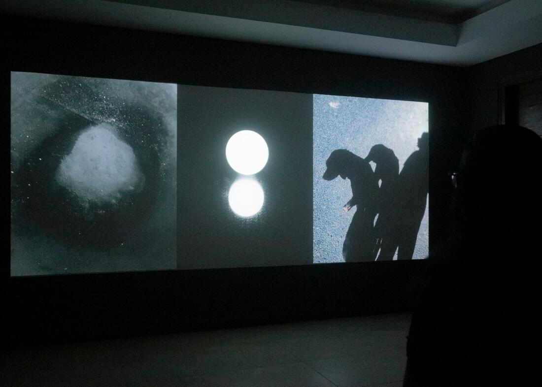
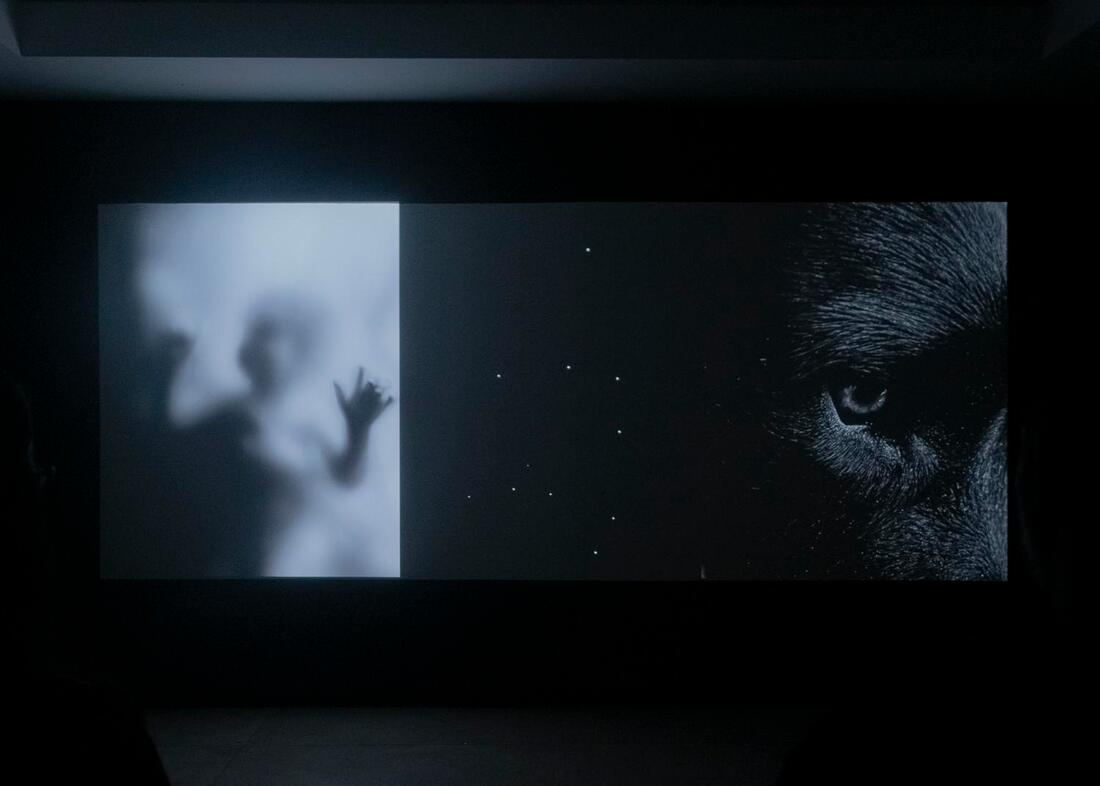
In Protick's work "Raśmi/Ray" we see features of photography from Protick's everyday life, where 2-3 images will be put together, without contextual correlation, but they match aesthetically and present the same feeling. "Rasmi, lands us in his personal truth, or sought to reconcile the competing influences of a natural world full of ambiguities, and indeterminacies, an uncertain and paradoxical inner voice, and an embodied transformation shaped by conflicting reflections."
This work is presented in a dark room where the images are projected onto a wall, fading into the next set of images, combined with sounds to illuminate what the work and feeling that instills in the viewer.
|
|
My Response
Final Edit
Warped Texture 7: Portraiture
Artist Reference : Wendy Laurel
The inspiration for this development comes from Wendy Laurel, who souped her images that she took on holiday to experiment with the technique, this includes portraits of her family, which is what interests me.
I will differ from my previous parts of the project and develop this into a set of images that are souped but feel more personal.
Below are examples of her images.
I will differ from my previous parts of the project and develop this into a set of images that are souped but feel more personal.
Below are examples of her images.
|
|
Process
As I want this part of the project to be more focused on the subjects I photograph with the patterns interfering with them, I will take pictures of friends and people close to me, souping the images in things that these everyday people could have like Coca Cola and Salt. I will leave these in for 2 days then dry them and have them developed, uploading them all but editing the best ones where the patterns formed in interesting places and formed properly.
I will ask the people what they want me to use to soup the images so they feel more personal and connected to them.
I will ask the people what they want me to use to soup the images so they feel more personal and connected to them.
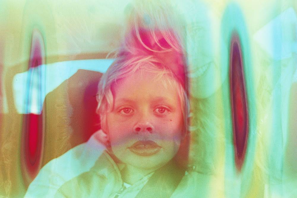
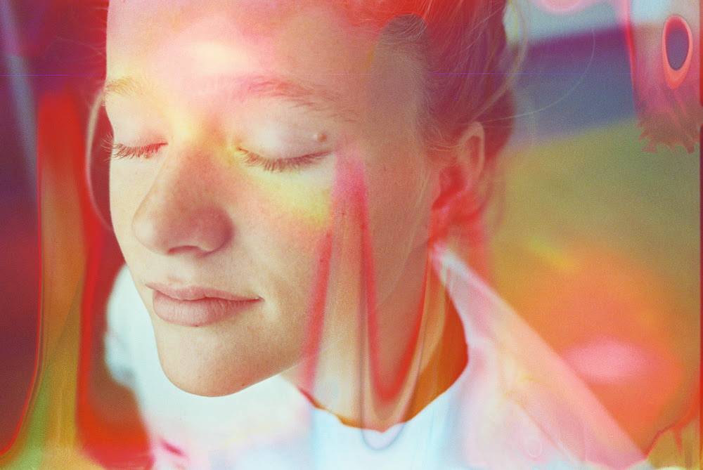
Final Piece
My Developments
At the beginning of this project, I knew I wanted to create work relating to the idea of texture, but as I have created work my ideas have grown and evolved with each development I have made.
I first took an interest in the texture of materials, like concrete, wood, etc, but took this idea further by creating a layer of texture over the top of images that already focused on that same theme, this is seen in my earlier developments of landscape photography which included countryscapes that were souped in chemicals and liquids with high acidity or alkaline levels to affect the images, with inspiration from Tom Evans.
I decided that I wanted to do the same thing for cityscapes, souping the images in things that relate to the time or location, like alcohol for central London on a Saturday night, now taking more inspiration from Seung-Hwan Oh.
When I went to Paris, I used different types of film to fit my theme, using colour-changing film and expired 20 year old film, which gave me a deeper interest in film photography as well as capturing my theme of texture in different ways, however I still desired to use the souping technique as I really like the way the chemicals create another layer of texture over the top of your image that you can only have so much control over.
I felt like I wanted my images to be more personal, and moved to portraiture to achieve this, taking inspiration from Marta Bevacqua and Wendy Laurel.
I also took an interest in combining types of media, specifically digital and film photography.
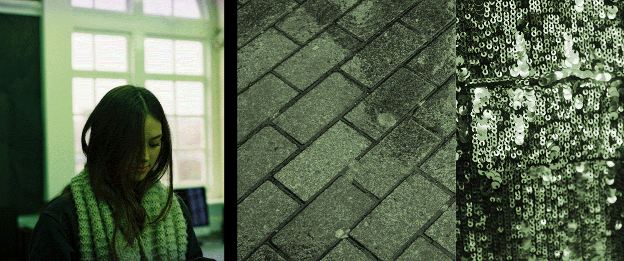
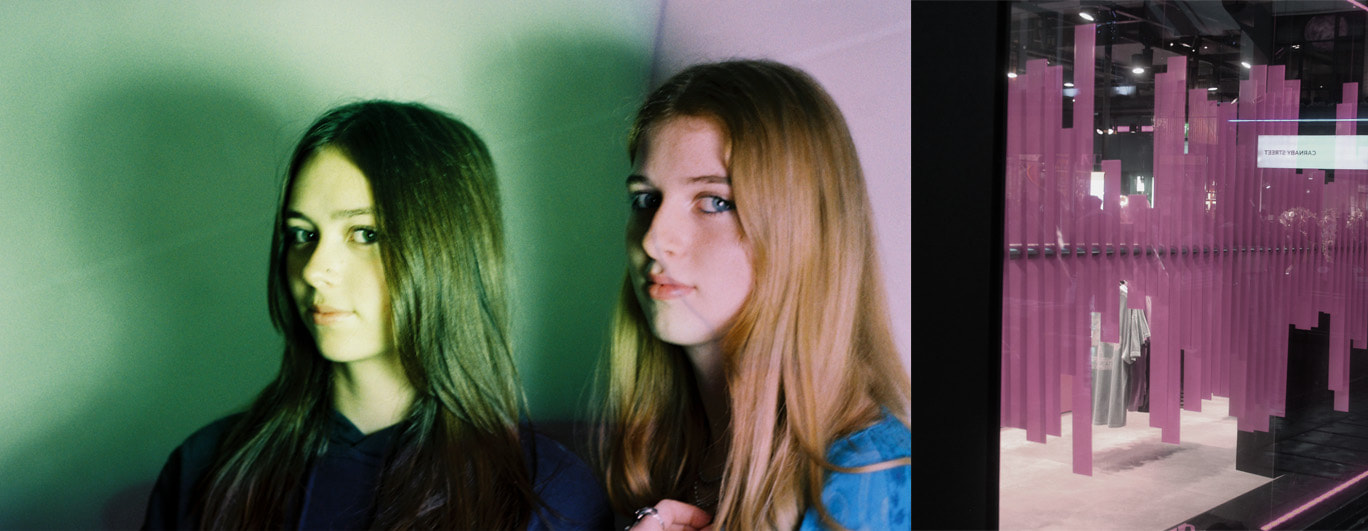
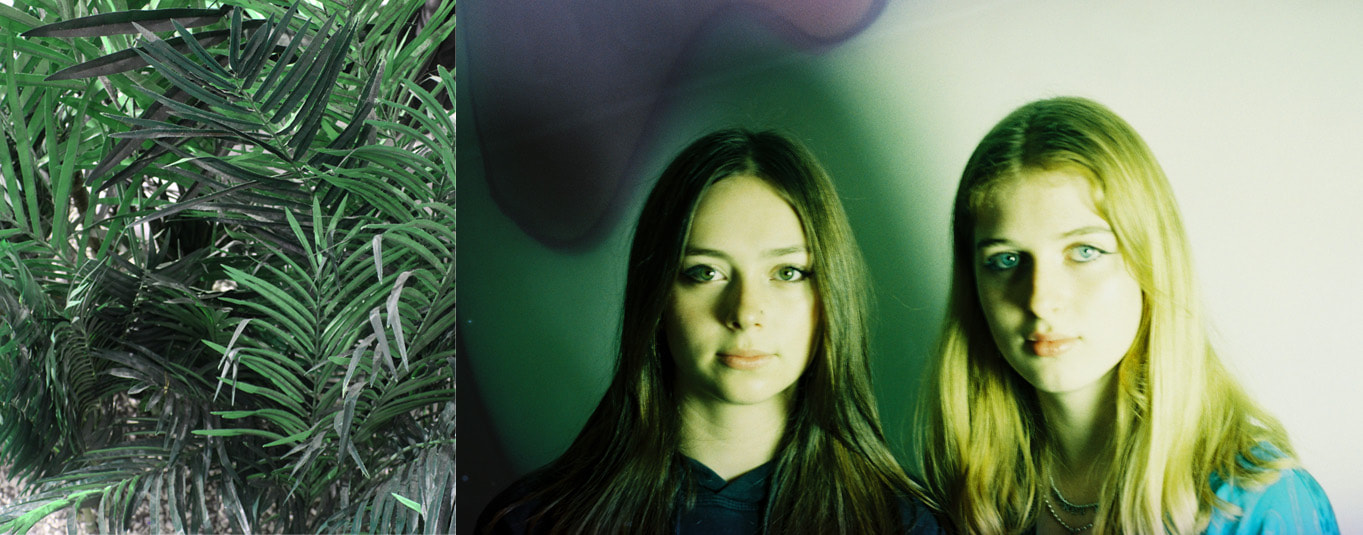
For my final piece, I want to present a friendship between two people, showing their differences, similarities and relationship together. I did this through presenting digital images in a collage/set of images that do not link to each other contextually, but evoke similar feelings and present the images that reveal personal truth through nature, everyday life and texture.
I souped the images in a mixture of both the friend's favourite drinks - green tea and Coke, this makes the souping feel more related to them rather than my previous soups which have been broader and less personal.
I included images of them that are not in front of the lighting or background for this natural feeling as well, and took inspiration from artist Sarker Protick in my technique of displaying the images; in gif format so that the images cycle through in the format they are arranged in.
I first took an interest in the texture of materials, like concrete, wood, etc, but took this idea further by creating a layer of texture over the top of images that already focused on that same theme, this is seen in my earlier developments of landscape photography which included countryscapes that were souped in chemicals and liquids with high acidity or alkaline levels to affect the images, with inspiration from Tom Evans.
I decided that I wanted to do the same thing for cityscapes, souping the images in things that relate to the time or location, like alcohol for central London on a Saturday night, now taking more inspiration from Seung-Hwan Oh.
When I went to Paris, I used different types of film to fit my theme, using colour-changing film and expired 20 year old film, which gave me a deeper interest in film photography as well as capturing my theme of texture in different ways, however I still desired to use the souping technique as I really like the way the chemicals create another layer of texture over the top of your image that you can only have so much control over.
I felt like I wanted my images to be more personal, and moved to portraiture to achieve this, taking inspiration from Marta Bevacqua and Wendy Laurel.
I also took an interest in combining types of media, specifically digital and film photography.
For my final piece, I want to present a friendship between two people, showing their differences, similarities and relationship together. I did this through presenting digital images in a collage/set of images that do not link to each other contextually, but evoke similar feelings and present the images that reveal personal truth through nature, everyday life and texture.
I souped the images in a mixture of both the friend's favourite drinks - green tea and Coke, this makes the souping feel more related to them rather than my previous soups which have been broader and less personal.
I included images of them that are not in front of the lighting or background for this natural feeling as well, and took inspiration from artist Sarker Protick in my technique of displaying the images; in gif format so that the images cycle through in the format they are arranged in.
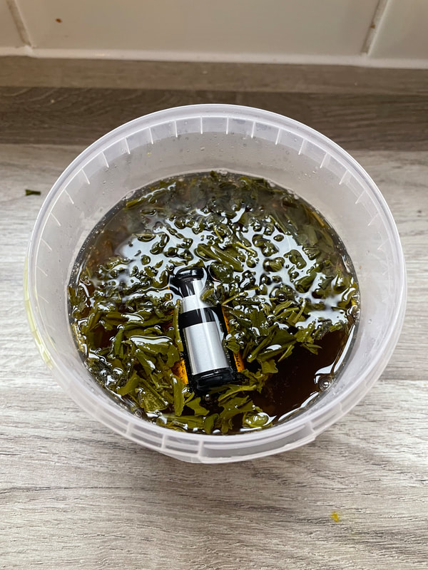
Process
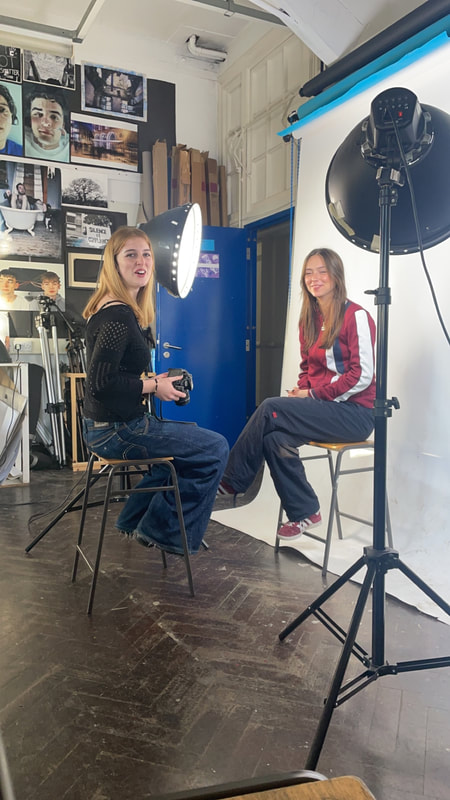
- Taking the portraits to soup.
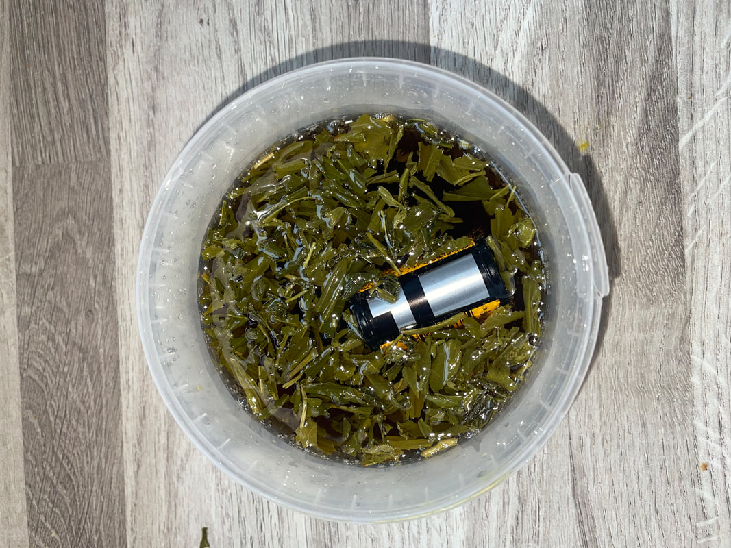
- Souping the film in a mixture of green tea and Coca Cola.
|
|
- Putting together the collages and editing the images.
- Creating the gif to cycle through the images.
Final Edits
|

|
Evaluation
WWW: Over the course of my project I really found my own look and feel for my theme of "texture". I developed my work over the course of multiple developments where my project evolved and became more personal to myself, moving away from relying on artists to take inspiration from, but still having an understanding of the other artist's work and how it helped me along the way.
I used a unique technique of souping film and combined it with other examples of media such as gifs and digital photography.
I believe I created a set of images that have real ideas and meaning behind them whilst also being created well. I edited the images professionally to achieve the look I wanted to, and conveyed my own idea behind my photography, which is all focused properly and framed well. Overall I think I really achieved what I was going for relating to my art around the theme of texture.
EBI: Include more close-up images to create a better sense of rapport within the images, feeling related to the model's in the photographed. Potentially include sound as another form of media related to the work to convey further emotion in the final project.


